Font Family in e-Commerce: What Differentiates Luxury from Mass in Fashion
- Marina 2Jour

- Sep 13, 2024
- 2 min read
Yesterday, H&M introduced a new take on the brand. Along with the new collection, featuring Lila Moss in the campaign, and new stores unveiled yesterday, they also revamped their website.
While I haven’t explored all the website updates, the first thing I noticed was the new font.
You might consider it unimportant in the overall website design. However, beyond technical features of fonts in e-Commerce such as:
✅Enhancing readability (especially across different devices) – or, on the contrary, 🚫fonts that are too decorative or complex can make the text harder to read, leading to frustration and lost sales.
✅The right font family contributes to a polished, professional look, helping customers feel more confident in their purchase decisions while 🚫a mismatched or overly casual font can reduce trust.
- font family is an invisible but powerful tool for maintaining brand consistency.
For example, serif fonts convey elegance and tradition, while sans-serif fonts evoke modernity and minimalism.
📌What if we consider a brand's pricing strategy in relation to fonts?
"Luxury fonts" lean towards elegance, with fine details and a minimalist, refined approach.
"Mass-market fonts" prioritize clarity, boldness, and functionality to appeal to a broad audience.
***
H&M has switched to the sans-serif family, including Hiragana Khaki Gothic Pro, Osaka, and MS Gothic fonts. These are well-suited to mass-market applications due to their simplicity, clean lines, and functional design.
***
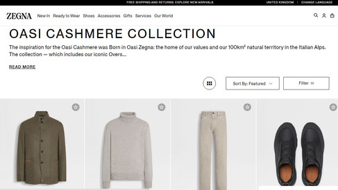
In 2Jour Website Check "Which quiet luxury brand sells men's shirt better" Zegna left its competitors, Loro Piana and Brunello Cucinelli, well behind. After a comprehensive review, the final score was:
Brunello Cucinelli: 8.5
Loro Piana: 6
Zegna: 10
The analysis focused more on customer experience, particularly regarding technical execution and the information provided for a male audience.
However, if I had to rate the brands' website fonts in terms of luxury versus mass-market perception, despite being in a similar price category, my ranking would flip, with Loro Piana at the top (serif fonts), Brunello Cucinelli (sans-serif and monospace fonts) in second place, and Zegna at the bottom (sans serif fonts).
* Oh, I remember how long it took me to choose the font for 2Jour-Concierge.com, and now that I’m considering changing it, it’s already making me stressed x


