New & Statement: How To Introduce A Luxury Item Online. Dior, Loro Piana, and Louis Vuitton Collection Page Examples.
- Marina 2Jour
- Aug 2, 2024
- 3 min read
The art of introducing a new product online has become a delicate dance between storytelling and the actual act of sales. We are not talking about a product page here, but rather a collection page, as usually the item comes in different variations and takes center stage on the brand's homepage as a new line. Let's take a look at three luxury brands - Dior, Loro Piana, and Louis Vuitton - showcasing their latest updates. I find it ironic that all three belong to one luxury group, LVMH, but have different road maps.
Christian Dior
Object: Groove Bag
Dior starts with a story. Luxury needs a story as it's is part of its price tag. So giving a glimpse into the object way contributes to marketing efforts.
Dior's leather goods lines are enriched by the Dior Groove bag, presented at the Dior ready-to-wear autumn-winter 2024-2025 show. Its supple, Boston curves are adorned with Dior Oblique jacquard, as well as the pared-down motifs of macrocannage and Graphic Cannage – traced in relief on the leather. An unprecedented accessory that can be carried in a variety of ways, inviting freedom of movement.

The collection page will most likely stay on the website (unless the brand decides to discontinue the bag at some point). Therefore, making the description thoughtful rather than formal is essential. In the case of Dior, the description tends to be more formal, and some parts could be developed further to engage with clients.
After the description, there is a product grid (I don't like using the word "product" for luxury items, but it is what it is). The product grid is mixed with a few lifestyle pictures, enhancing the presentation.

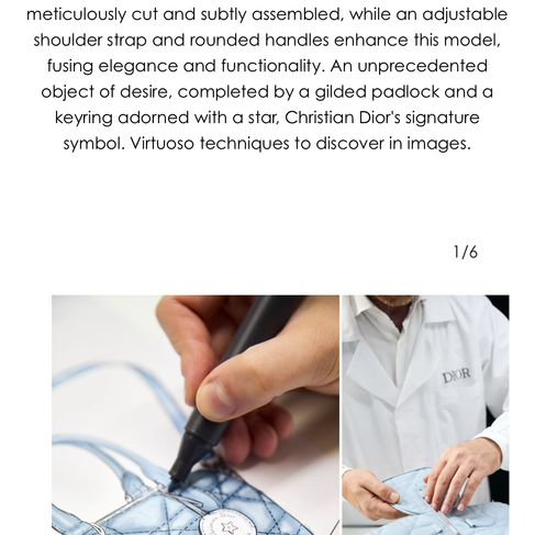
At the bottom of the collection page, there are visuals including videos, photos, and the story of savoir-faire - the craftsmanship process and the latest trend within luxury brands to enhance the item's value. While brands actively use the trick with inspiration behind the design to the craftsmanship involved to add depth, meaning and extra hundreds or (thousands) on top of price tag, it’s not often incorporated into the collection page structure - rather, it's found in social media or a separate story section. I definitely like it added to the collection page, like Dior did.
Overall, while the presentation could be better - it seems a little airy to me - the structure used is a good example to showcase the new item.
Loro Piana
Object: Loom Bag
Unlike Dior, Loro Piana didn't try too hard with its newest addition to the bag lines - The Loom Bag (the bag is beautiful; I've already checked it in a boutique). The collection page for the item seems to say without saying a word:
It's a Loom Bag, it's by Loro Piana, what else do you need?
Literally - the brand doesn't even mention the price on the desktop version until you point the mouse on the item, not to mention giving a story behind it - these items are for those who don't care about the money. I am not sure whether the thing with the price was a forever practice, but any ideas why it's a rather wrong approach? Anyway, I could say the presentation might be better, if there was a presentation at all:)
Louis Vuitton
Object: Montsouris Backpack
Louis Vuitton took a straigtforward approach - starting from clear "Shop Now" call-to-action message and adding items grid under lifestyle pic (with one extra item which is from different collection, most probably because 3 item grid was not considered to be appealing) on homepage to displaying the backpack with no description on general handbags page. Yes, if you browse further there will be all the handbags brand currently has for sale. The overall feeling is no matter what - LV just wants to sell you something:)
*I offer e-commerce cosultancy to enhance luxury brand's online presense. Details:


