How to Present a Lookbook Online: Do's by Cartier, Don'ts by Saint Laurent
- Marina 2Jour

- Aug 5, 2024
- 2 min read
Updated: Oct 14, 2024
To make the lookbook captivating and converting online, it requires a blend of:
visual appeal (the attractiveness or aesthetic quality)
strategic organization (arranging in a thoughtful and purposeful way to achieve specific goals)
While the visual aspect may seem self-evident, maintaining consistency is essential—everything should look like it belongs together, from the images to the text, with a clean and intuitive design.
Strategic organization is often overlooked entirely, yet it is crucial for guiding viewers toward the set goal. For luxury fashion and jewelry, this goal is ultimately to sell the item.
Let’s look at two examples I recently came across. One is an example of how-to, and the second misses key touchpoints to engage with the customer.
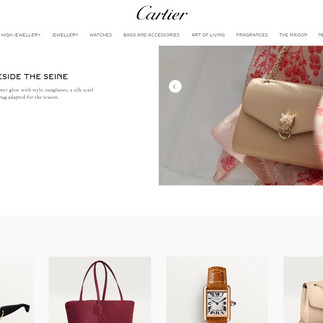
Cartier launched an ad campaign a while ago with brand ambassador Lily Collins. The idea behind it is spending 24 hours of summer in Paris. The pictures feature both Lily in and among Cartier objects, as well as single items.
To display it on official website Cartier used both homepage to introduce the campaign, and individual page to tell a story.

On the individual ad campaign page, Cartier maintained a balance between lifestyle pictures and featured items. Like the bag or earrings you see in the picture? A product grid is displayed right under the lifestyle shot, so you can buy it right away.
The lookbook is displayed in the chronological order of one day, from morning to night. Each picture is accompanied by a short text (though I would add some more creativity to it). Items from different categories are displayed throughout the story—from jewelry and bags to sunglasses and lifestyle items. Overall, due to the smart balance, the overall thread unites everything into a cohesive and not overwhelming display.
Along with its new website design, Saint Laurent has launched Tan Lines. It’s a selection, as mentioned in the highlight, but nothing else is mentioned. Lifestyle pictures come along with a product grid, but the product grid itself doesn't contain any words or prices—a customer might not even realize that clicking on an item picture will lead to an item page.
While minimalism can be beneficial, in this particular case, such a display lacks context and engagement.
In conclusion, Cartier effectively engages customers with a balanced mix of lifestyle images and clear product links, enhancing the shopping experience. In contrast, Saint Laurent's minimalist approach, though visually clean, lacks context and engagement, potentially confusing customers. For an impactful lookbook, balancing aesthetic appeal with functional design is crucial.
*Need help optimizing your online presence? I offer e-commerce consultancy. Details are here.


