How To Communicate Sustainability Online Better. Chloe, Gucci, Loro Piana, Maison Margiela & Prada Examples & Insights
- Marina 2Jour
- Jul 20, 2024
- 6 min read
Updated: Oct 14, 2024
'Luxury has a new definition. It now means craftsmanship, excellence, and storytelling but also authenticity, sustainability, and trust as new core values.' — this is the introduction to a paper published a while ago by Aura x Deloitte I was struggling with this the other day. Indeed, the market dictates new rules. While previously sustainability was more of a choice than an obligation, now, to remain successful (and profitable), luxury businesses can't ignore it.
New generations of customers pay great attention to sustainability and want reassurances on where products come from and the materials used.
— the report also says.
Taking a lot of effort to be implemented, the sustainable approach has become a powerful marketing tool and part of the storytelling of luxury brands, so making this effort visible to customers can contribute to their decision to purchase a product.
Before we start with a few examples on how luxury fashion brands communicate their sustainable endevaours and achievementslet online, let's think what makes communicating sustainability in e-commerce succesful?
1. A clear summary message at the beginning:
You can never be sure how long you will be able to keep the attention, so start with the main idea in simple words from the beginning.
2. Easy to understand:
Professional language is acceptable when discussing a topic among specialists. However, using it in communication with a broader audience, for whom this is not a primary interest or profession, leads to losing that audience. Few people enjoy feeling confused, and not everyone has the time or inclination to decipher the intricacies of professional jargon. I am writing this after spending long hours trying to grasp the concept of the Aura Consortium Blockchain (we'll discuss it further on). I read its website and reviewed the report, but I still don’t have a clear understanding of its mechanism.
3. Structured:
Balance details with readability. Highlight the most critical sustainability features and achievements, and use expandable sections or links for customers who want more detailed information.
4. Visible:
Create a separate tab or section to ensure that customers interested in sustainability can easily find it. This approach can also serve as an added incentive for potential buyers who might not prioritize sustainability but appreciate it as a beneficial factor in their purchasing decision.
Let's take a look at a few examples in e-commerce of displaying sustainability efforts I've recently came across.
Chloe (Richemont)
Chloé has all eyes on it this autumn with the new creative director Chemena Kamali. While I notice many gaps on website in terms of engagement and utilizing all touchpoints in the brand's e-shop, but apart from that, there is a strong intention to display its sustainable efforts.
Two mentions in the header will both lead to a broad introduction to sustainable commitments.
While the visuals are engaging, the text is overloaded with information. To improve readability, anchor links and better structure would be helpful.

Traceability of items is also mentioned on a product pages under a separate tab — this makes the message more distinguishable, and the additional visuals in the tab are engaging. To further engage the client, I try to use additional links where possible; in this case, a link to the sustainability pages displayed before would pique further interest.

Gucci (Kering)
Gucci doesn't have a clear focus on sustainability in the overall website display and menu.

But it has an eye-catching icon with the title 'Our Commitment' on the product page. The title is not very clear — commitment to what? — and the same applies to the expanding text when clicked. The text is unstructured and, in the end, invites you to check another link to learn more.

Similar to Chloe, through the link there is a lot of information that shows the brand's strong commitment to its sustainable efforts. However, when creativity goes too far, it becomes difficult to perceive. The website is hard to navigate, using bright colors and strong fonts. As a customer, I would give up within minutes trying to learn more about the materials of the item I’m interested in. Simple and structured communication is lacking, and this is what would definitely improve how sustainability is communicated.

Loro Piana (LVMH)
The Linen Andre shirt is an icon for the brand (and I will have an interesting publication on it soon). It has a compelling story behind it and a Google trend-recognized interest, which most likely converts into sales.
When it comes to the brand’s signature items, the communication should be noticeable but even more careful, especially considering that last spring, Loro Piana failed to react to the scandal over its other staple – Vicuna fiber, used to produce its most expensive items. Any misstep, and the scrutiny will be even more intense. Another noteworthy aspect is that icon status implies a 360-degree view.
Recently, the brand published six consecutive posts on its official Instagram page with the main message.
The Andre shirt in linen is now traceable and registered on the Aura Blockchain Consortium platform.
Well, I assume it was the main one since it was repeated at the end of each of the six posts, but it wasn't highlighted in any way with a new line (and long texts without structure are off-putting and make it difficult to focus on the main point).
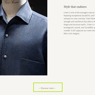
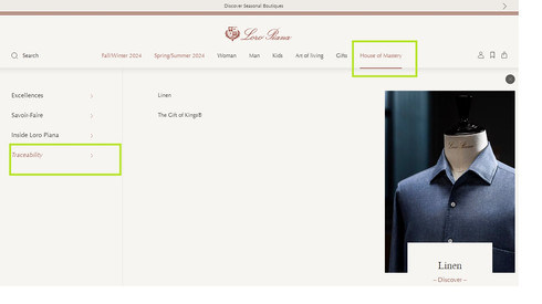
The same communication about The Andre Shirt Traceability is on Loro Piana's official website—scattered without a clear message. While the news about the shirt being traceable is displayed on the homepage, the link leads you to the manufacturing process, which is good to mention along with a beautifully shot picture. However, it does not reveal or enhance the essence of the main message. Instead, the word "traceability" is not even used in the text or headline under the homepage title "The Linen Andre Shirt, Now Traceable."
If you follow the link at the bottom of the article, you will reach another page that is also mentioned in the website menu regadring traceability. Finally, at the bottom of this page, you will find a mention that you can 'discover the journey of your Linen André shirt, from field to fiber to final product through the Aura Blockchain Consortium.' It took some effort, didn't it?:)
Not to mention, after exploring the Aura website for some time and reading the report on the system, I still didn't understand the mechanism. Therefore, explaining what Aura Blockchain Consortium actually means or providing a link to the official website would be helpful for those who may not be familiar with it.
If we check the product page for Andre shirt there is no a message on its traceability. Which means the communication was not performed at its best and additional selling points were not utilised.
In summary, a beautiful picture, which surely required considerable production effort, is not supported by coherent meaning.
How can communication be improved? Return to the mentioned principles of successful sustainable communication online and apply them all:)

Maison Margiela (OTB Group)
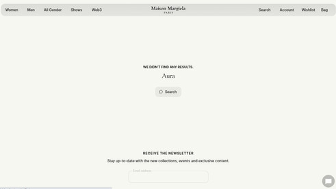
Maison Margiela is a part of Aura as well. But there is no mention of this on the brand’s official website.
The technology is used in perhaps the brand's most recognizable shoe model—Tabi. It is mentioned on product page. However, the message about it is not highlighted in a separate section, gets lost at the end of the description, and includes a non-clickable link.
OTB Group, which owns the brand has joined Aura as steering member along with LVMH, Prada Group and Richemont. The group has a section on sustainability in menu header on its official website along with appealing video on how it works, which might be used on Maison Margiela website.
Prada (Prada Group)
Prada has a link to the sustainability page at the bottom of its website in the company information section. While it is not prominently displayed, it maintains a logical order. If you explore further, there will be a mention of Aura Blockchain and the Eternal Gold collection it used within Prada.
What I especially like is the direct link to shop the collection at the bottom of the story—an example of building engagement by integrating transitional links into the website structure.

On the product pages of items from the collection, there is a mention of using Aura Blockchain. To make the message stronger, it could be highlighted in a separate tab, and a link to the relevant section with more detailed information about the technology could be added to the text.

Want to make you website speak your values better? I offer tailored consultancy to communicate brand’s values and perform through websites better. Check for details here:


